Regression Trees
In this chapter, We show how regression trees can fit non-linear data.
## Packages
from sklearn.tree import DecisionTreeRegressor
from sklearn.model_selection import train_test_split
import matplotlib.pyplot as plt
import seaborn as sns
from sklearn.metrics import r2_score
from sklearn.metrics import mean_squared_log_error
import pandas as pd
import numpy as np
from matplotlib import pyplot as plt
from sklearn.linear_model import LinearRegression
from sklearn import tree
First, we generate random data with two variables x and y such that it forms four clusters i.e., a non-linear shape. As you can see from the scatter plot, it looks very difficult to fit a linear regression model. That said if we fit linear regression and plot, clearly the line does not have a great fit
np.random.seed(0)
g1 = [round(np.random.uniform(1, 2), 2) for i in range(5)]
g2 = [round(np.random.uniform(10, 11), 2) for i in range(5)]
g3 = np.random.randint(50, 60, size = 5).tolist()
g4 = [round(np.random.uniform(20, 21), 2) for i in range(5)]

df = pd.DataFrame({
  'x': np.arange(1, 21, dtype='int').tolist(),
  'y': g1 + g2 + g3 + g4
  })

df
x y
0 1 1.55
1 2 1.72
2 3 1.60
3 4 1.54
4 5 1.42
5 6 10.65
6 7 10.44
7 8 10.89
8 9 10.96
9 10 10.38
10 11 56.00
11 12 57.00
12 13 57.00
13 14 58.00
14 15 51.00
15 16 20.93
16 17 20.07
17 18 20.09
18 19 20.02
19 20 20.83X = df[['x']] # Need two brackets for 1D - CRUCIAL *
y = df['y']
lin_reg = LinearRegression()
lin_reg.fit(X, y)LinearRegression()In a Jupyter environment, please rerun this cell to show the HTML representation or trust the notebook.
On GitHub, the HTML representation is unable to render, please try loading this page with nbviewer.org.
Parameters
Fitted attributes
plt.scatter(X, y, s=80)
plt.xlabel('X')
plt.ylabel('Y')
plt.plot(lin_reg.intercept_ + (lin_reg.coef_ * df['x']), color = 'blue')
plt.show()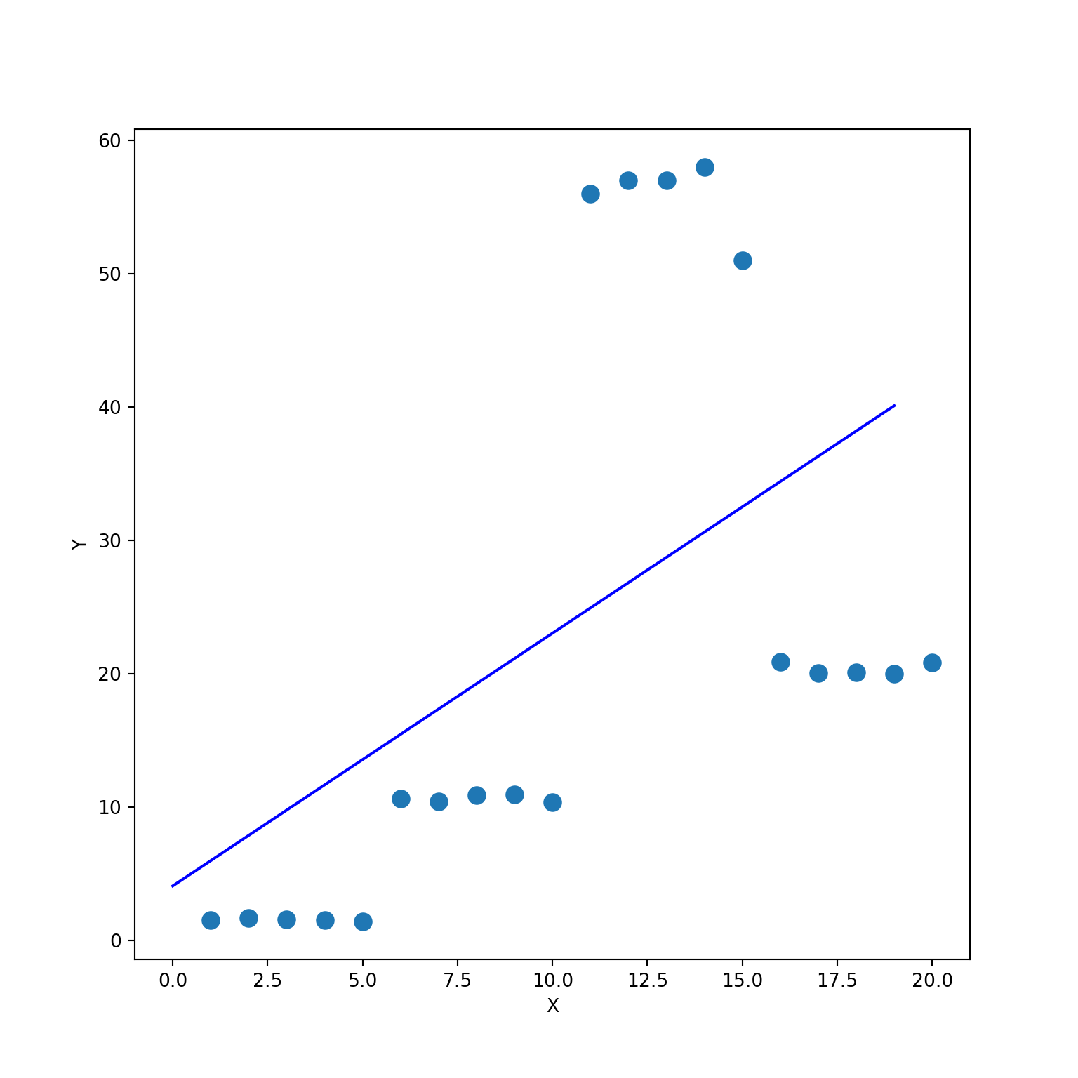
Instead, we can use a regression tree. The Predicted Values vs Actual Values plot tells that we have a perfect fit. Although this is a clear sign that our model is overfitting, I just wanted to demonstrate how powerful a regression tree can be when fitting a non-linear data.
dt_reg = DecisionTreeRegressor()
dt_reg.fit(X, y)DecisionTreeRegressor()In a Jupyter environment, please rerun this cell to show the HTML representation or trust the notebook.
On GitHub, the HTML representation is unable to render, please try loading this page with nbviewer.org.
Parameters
Fitted attributes
y_pred = dt_reg.predict(X)

plt.scatter(x = y, y = y_pred, s=80)
plt.xlabel('Actual Value')
plt.ylabel('Predicted Value')
plt.show()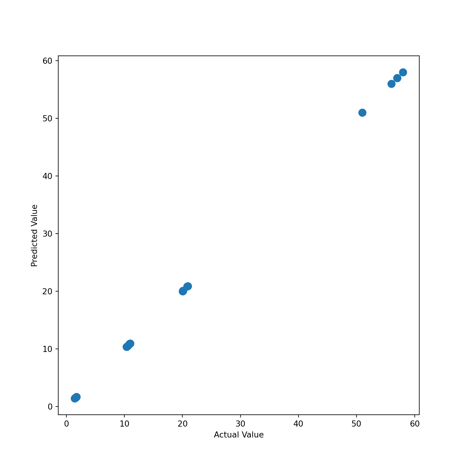
mean_squared_log_error(y, y_pred)0.0fig, axes = plt.subplots(nrows = 1, ncols = 1, figsize = (12,5), dpi = 400)
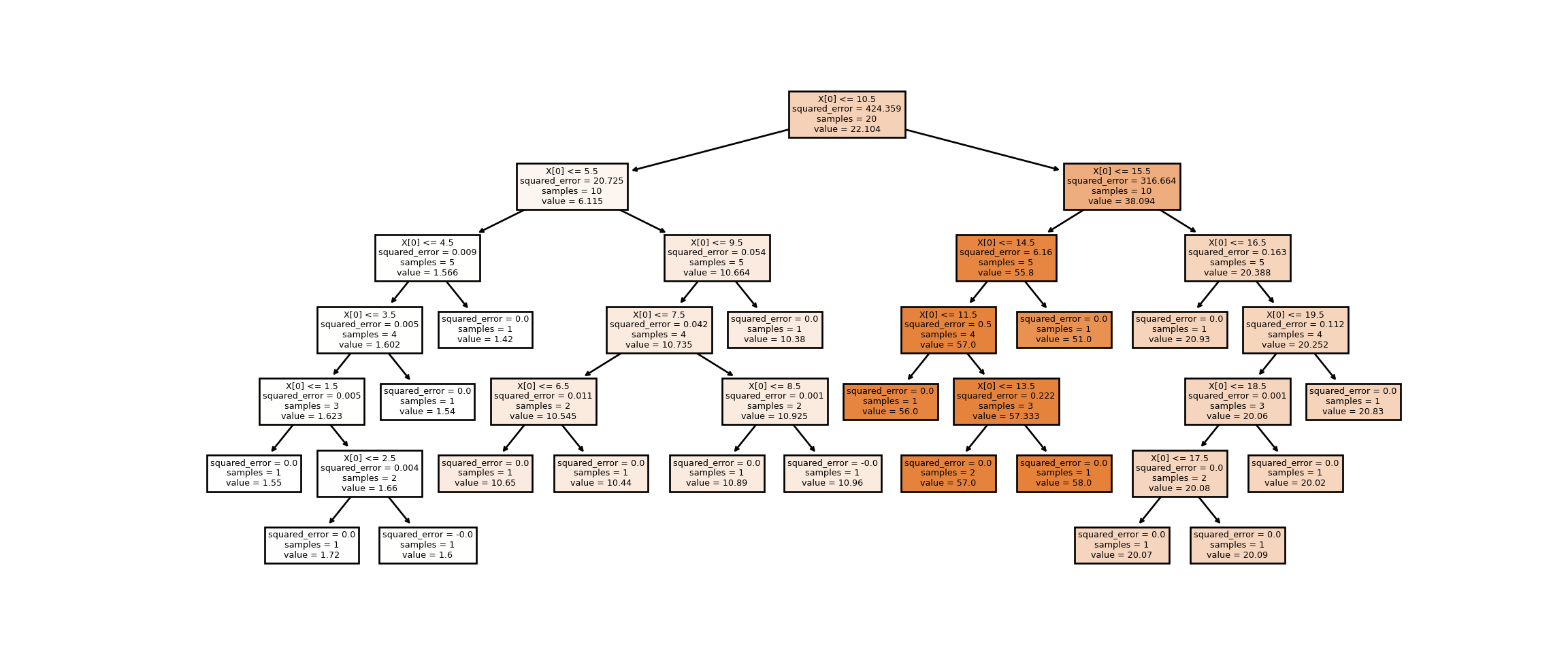
tree.plot_tree(dt_reg, filled = True)
plt.show()